The world movesat the speed of typing.We moveat the speed of ink.
A fountain pen & stationery channel
There is a particular silence that belongs to handwriting.
It isn't the absence of sound — it's the presence of attention. When a nib meets paper, the world narrows. The scratch, the sheen, the wet bloom of pigment settling into cotton fiber: these are not inefficiencies to be optimized away. They are the point. Inkwell exists because some of us need to remember what it feels like to think at the speed of a pen.

Sailor Jentle Yama-dori — First Impressions
Ink is not a commodity. It is a mood, a memory, a season.
Sailor's Yama-dori changes character from morning to evening. Diamine Oxblood writes like autumn light. Rohrer & Klingner Scabiosa develops a blue-grey patina that no printer could replicate. We've tested over 200 inks across 40+ papers and learned that the best combination is always the one you're using right now, in this light, with this thought.
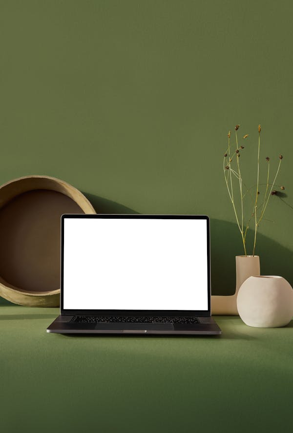
The Ritual of Inking Up — TWSBI Eco
Honest reviews. No affiliate anxiety.
We buy our own ink. We grind our own nibs. We test on papers we actually use — Tomoe River, Clairefontaine, Rhodia, Midori MD. When we say a nib is scratchy, we mean it. When we say an ink is worth hoarding, we've already hoarded two bottles. This channel is a record of obsession, not a catalog of recommendations.

Comparing 6 Iron Gall Inks Side by Side
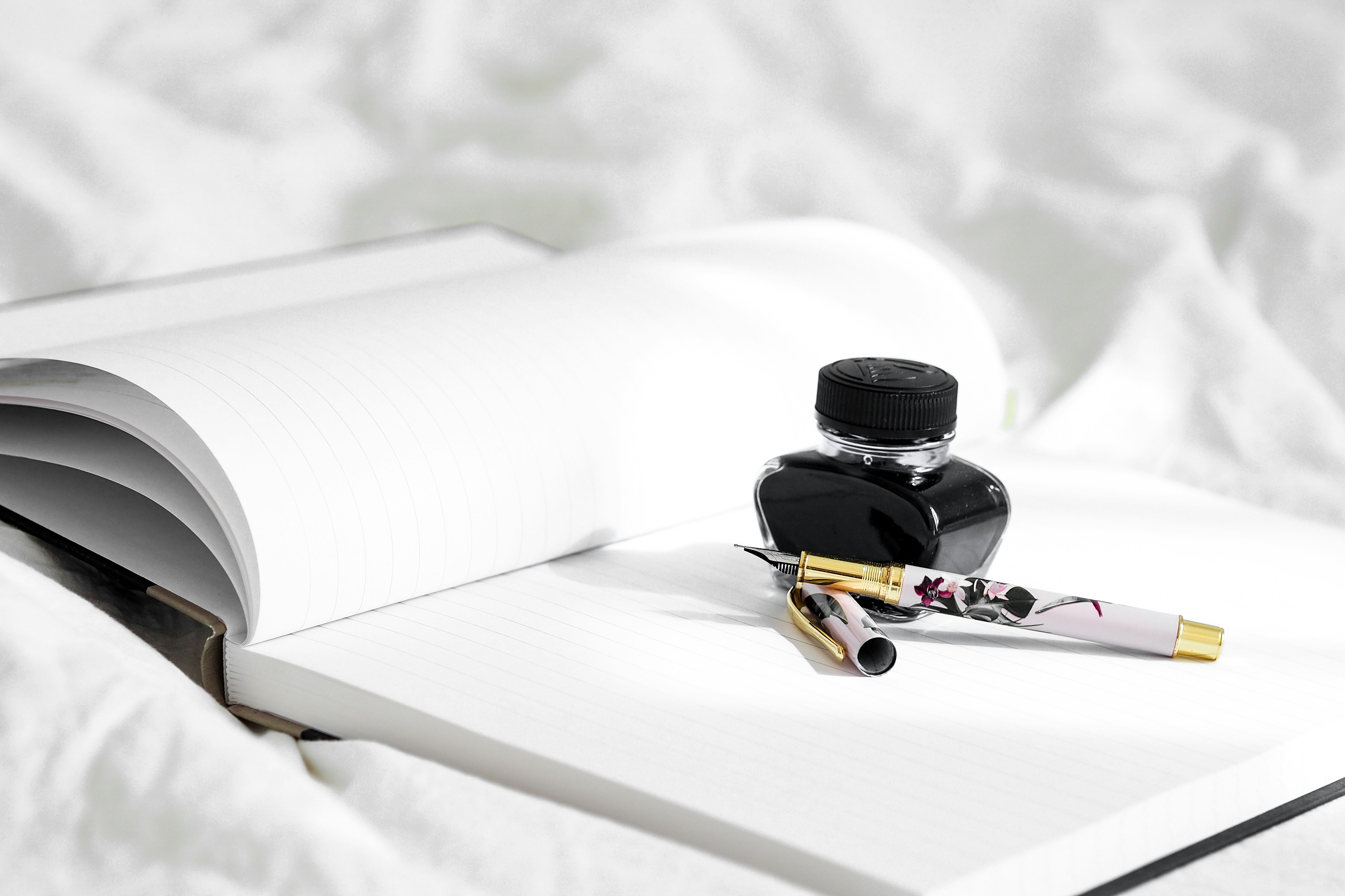
Two bottles worth reading about.
Sailor
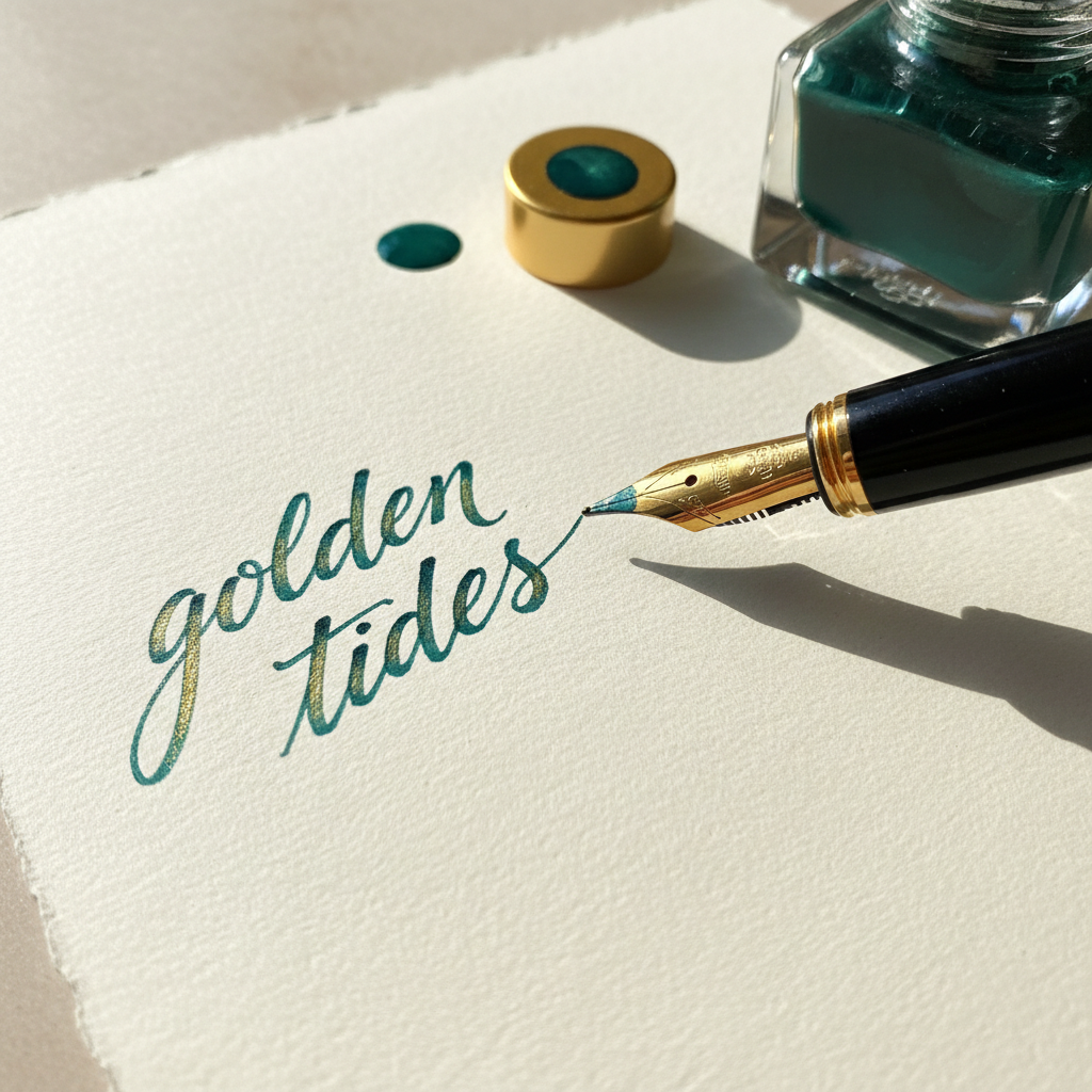
Sailor Jentle Yama-dori
Teal-green with heavy gold sheen
Yama-dori is named for the copper pheasant — and once you see the sheen, you understand why. On Tomoe River paper, this ink performs at a level that feels almost unfair. The base is a deep teal-green, saturated enough to read cleanly even in a fine nib. But the sheen — a heavy, warm gold that appears on every pooled area — is what collectors are actually buying. It develops with paper absorbency: Clairefontaine shows it moderately, Tomoe River turns every downstroke into a small spectacle.
Buy two bottles. The first is for using. The second is for the shelf.
Diamine
Diamine Oxblood
Deep crimson-brown, darkens with age on paper
Oxblood is a working ink. No sheen, no shimmer, no theatrics — just a deep, complex red-brown that reads like dried blood on parchment and looks like autumn in a bottle. It behaves impeccably across every paper we've tested, dries in under 15 seconds on Rhodia, and hasn't feathered once in 14 months of daily use. The color shifts slightly depending on lighting: cooler light pulls the brown forward; warm desk lamps reveal the crimson. It is, frankly, the ink we reach for when the writing matters more than the show.
The ink for people who want to think, not perform.
Choosing your nib is choosing your relationship with ink.
Width determines how much ink touches paper, how long it pools, and whether sheen becomes visible. This chart is the one we wish we had when we started.
Unforgiving on rough paper. Rewards Tomoe River and MD.
The workhorse width. Most accessible entry point.
The sweet spot for sheen chasers who still want legibility.
Ink performance peaks here. Paper quality becomes optional.
Adds line variation. The most expressive option for ink lovers.
* All measurements are approximate. Japanese nibs (Pilot, Sailor, Platinum) run approximately one size finer than European equivalents.
Weekly dispatches from the slow side of the internet.
Ink reviews, nib comparisons, paper tests, and the occasional meditation on why handwriting still matters. No algorithms, no sponsored content, no noise.
- Weekly ink review — one bottle, fully tested
- Nib spotlight — one grind, one maker, one technique
- Paper test — three papers, same ink, side by side
- The Starter Ink Guide PDF (12 bottles worth owning)
Join 4,200+ readers. Unsubscribe with one click. No algorithms, ever.
The Starter Ink Guide
12 bottles worth owning — across every price point, color family, and behavior type. The list we give every person who asks where to start.
Delivered instantly. No spam. Ever.